Today I decided to randomly start actually using a Pleroma account for real just so that I could see the state of the project.
If you’re not familiar, Pleroma is a micrblogging software occupying the same niche as Mastodon and GNU Social: creating a federated microblogging network. Here’s a humourous if you aren’t already familiar with federation.
Anyhow, how well does Pleroma work for what it’s supposed to do?
*Disclaimer: this is from a user perspective, not necessarily that of an admin. If I get around to setting up an instance of my own, I’ll make a separate post on that.*
Setting up an account
It’s pretty easy.
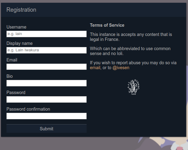
A possible concern is that it doesn’t ask you to verify your email, but at the same time it doesn’t really send emails, so I’m not sure how much of an issue it really is.
Posting on the desktop
The Pleroma interface is largely inspired by the Qvitter interface, which was in turn inspired by an older iteration of the Twitter UI. Unlike Qvitter though, it’s a lot less buggier and it does evoke a sense of comfiness to the experience.
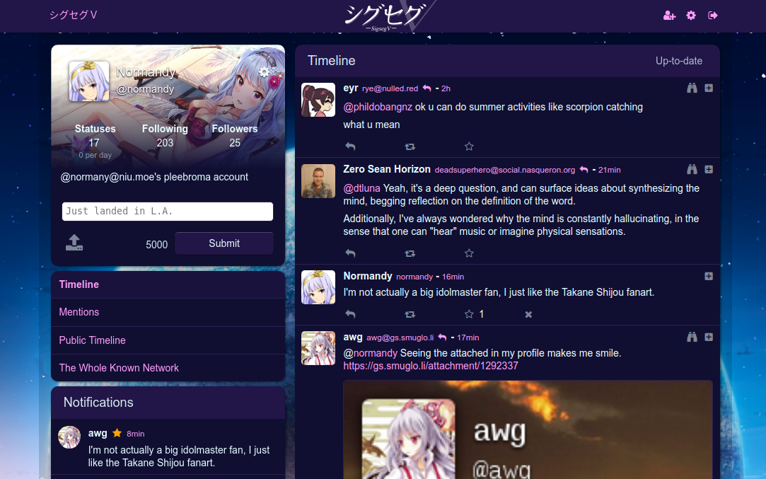
You get a nice single-column layout with all of the notices from your follows neatly laid out. Long notices are made bearable through the use of an insert with a scrollbar. Best of all, it’s pretty easy on the eyes.
The interface is also very customizable. There’s a set of nice themes that it comes with by default, but by no means are you actually restricted to them. You can change the colours of the background, header, text, and links. Profile customization is also really nice as well since you can set not just your avatar and profile header, but also the backround image as well – something I really missed from the old days of Twitter.
There is a minor gripe with the notifications however. It does seem to not keep track of any you’ve dismissed in between sessions. It also sometimes doesn’t show all unless you load older posts from the timeline for some reason.
However, if you are more of a Tweetdeck/Mastodon fan (in terms of the UI at least), there’s also an alternate UI accessible by appending /web to the instance domain.
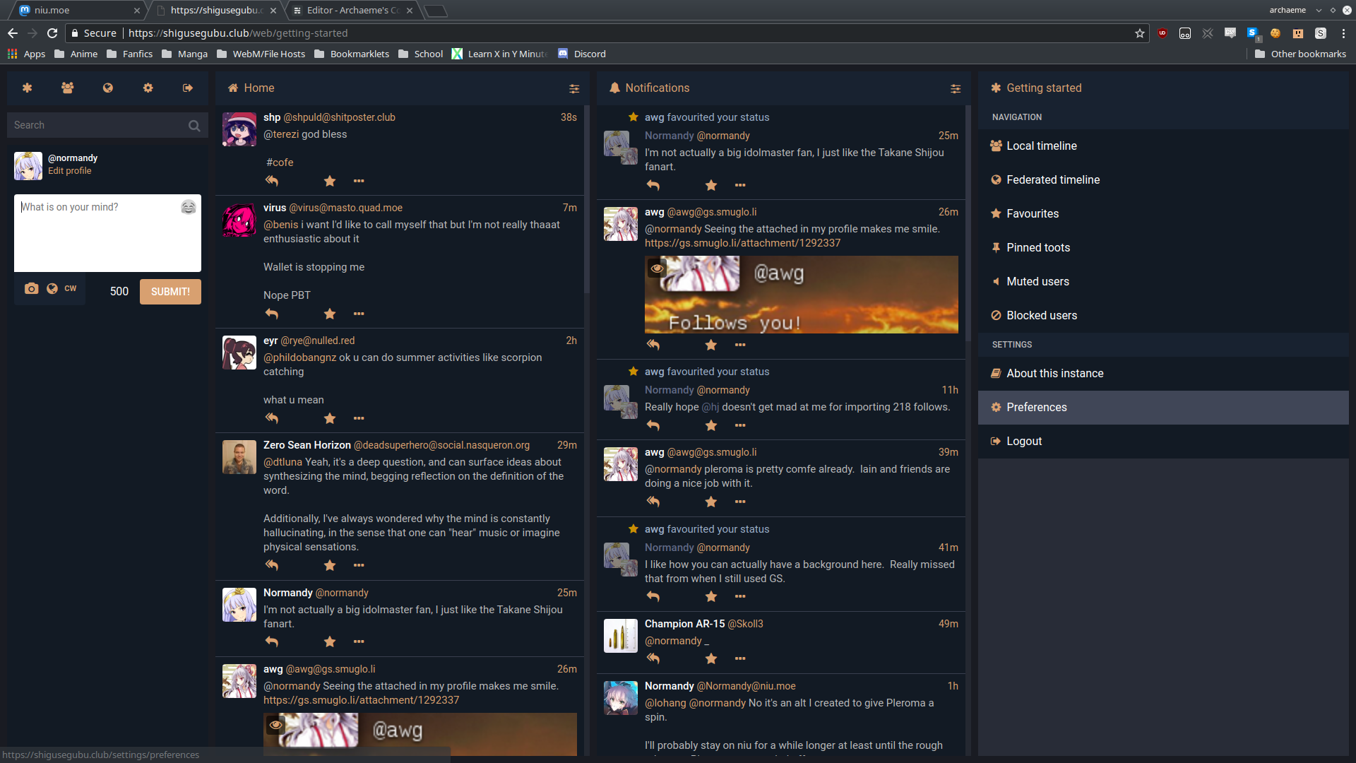
Some of the links such as the one to edit your profile don’t work properly, but otherwise it works as you’d expect.
Posting on mobile
The default UI is pretty responsive to mobile screen sizes. It will collapse into two columns: one for the left pane, and one for the actual timeline.
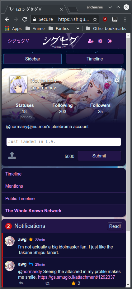
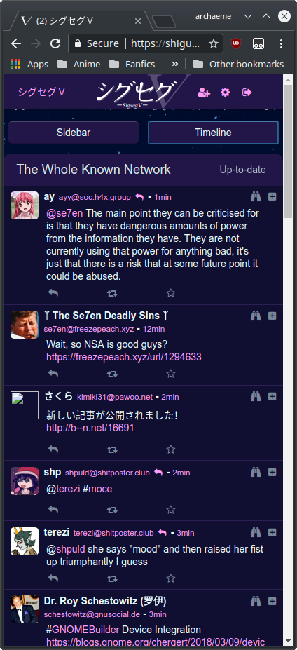
I do feel that it’s kinda annoying to switch back and forth between the columns. Clicking on which timeline to view doesn’t automatically switch you over to the timeline view, which can be a bit jarring.
Composing posts however, is pretty straightforward and doesn’t try to get in your way with autoformatting and “beautification”, which is nice.
The Mastodon-style UI also works on mobile, but you do get a “Not found” error, which can be dismissed by tapping on the icons above.
Using mobile clients
Now I’ve only really tested out Mastodon-compatible clients on my phone, so things could be different if you’re using a GNU Social-compatible one like Mustard or AndStatus.
My preferred Mastodon client works almost flawlessly except for a few popups displaying “An error occurred” even though it displays conversations fine.
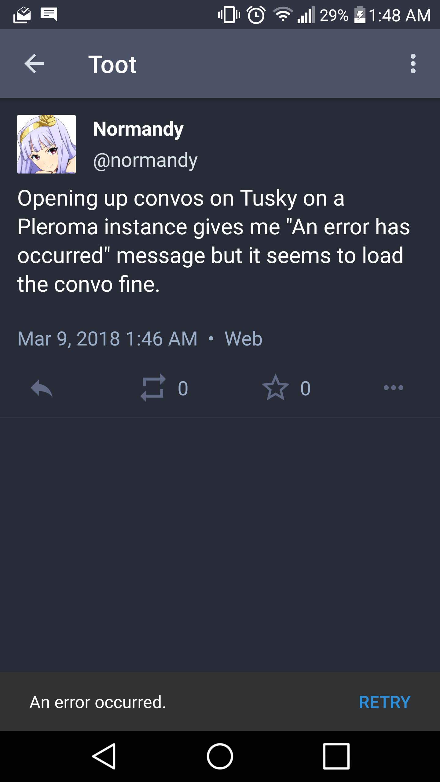
I did attempt to try out Mastalab as well, but it would crash whenever I tried to log in. The devs do admit that OAuth support isn’t perfect so it’s kinda expected.
Conclusion
For a project that’s only really started to take off since mid-last year (although the thing stemmed from the UI creation in mid-2016), I feel that the project has advanced quite a bit. Mastodon, which isn’t much older does feel more polished, but do keep in mind that it also has a much larger dev team and community working on it compared to Pleroma.
I am looking forward to seeing how it evolves and I may look into helping out a bit as well. Cheers!